Lifestyle Factors and Depression
Exploring key relationships in a simulated lifestyle & mental health dataset (N = 3,000)
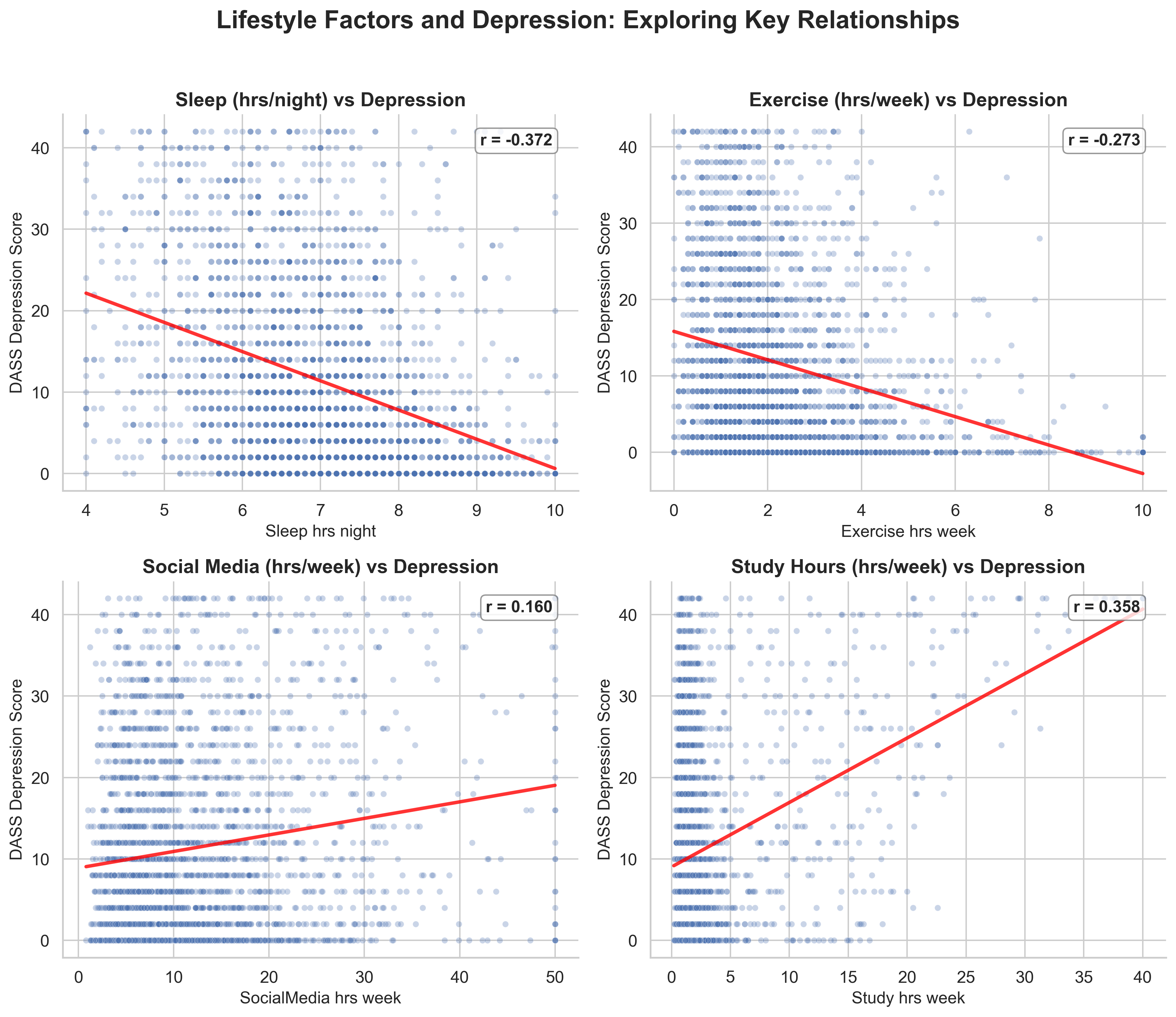
Notebook workflow — 2×2 scatter plots with trend lines and r values
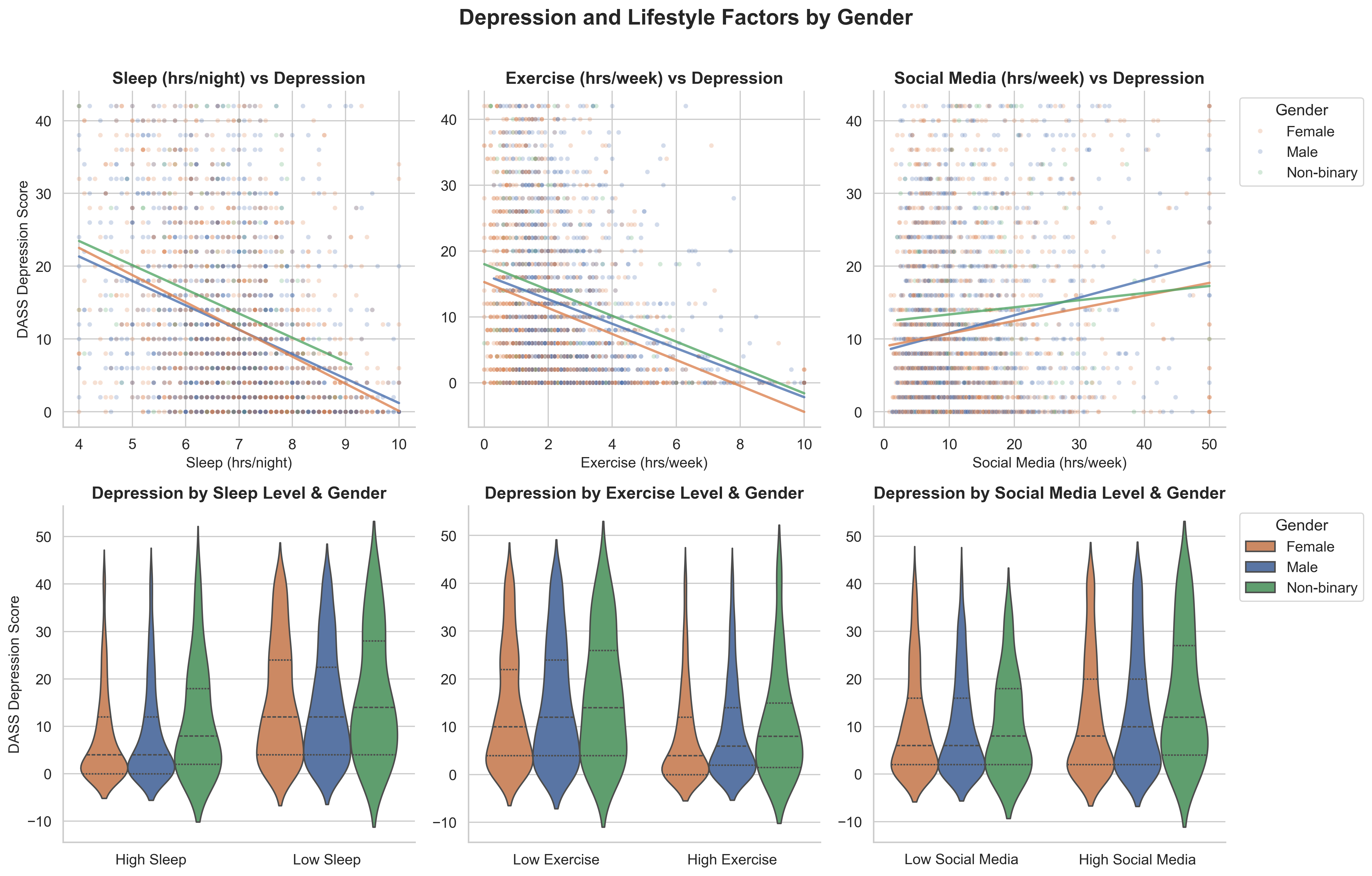
Script workflow — 2×3 scatter + violin plots split by gender
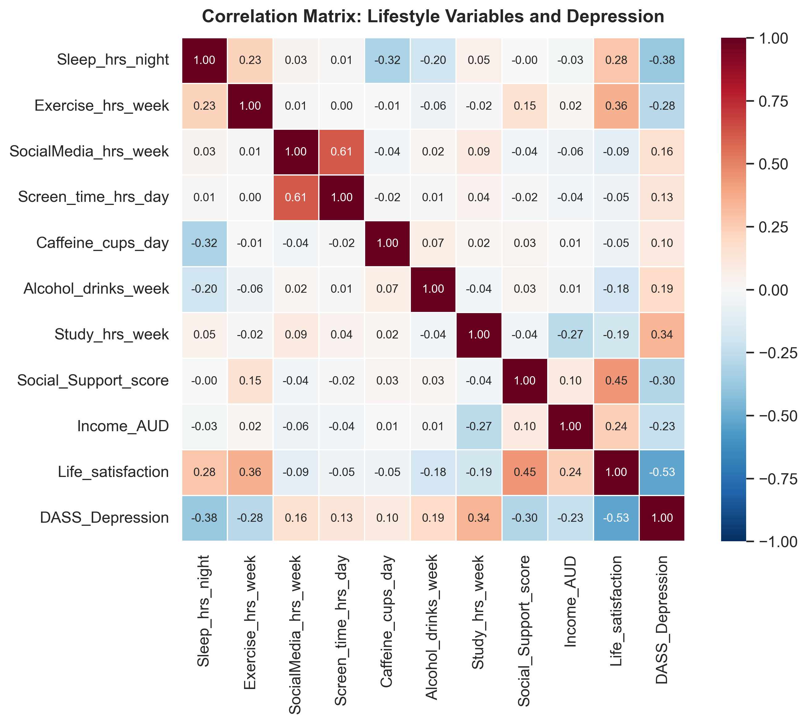
Data exploration — correlation heatmap showing which variables relate to depression
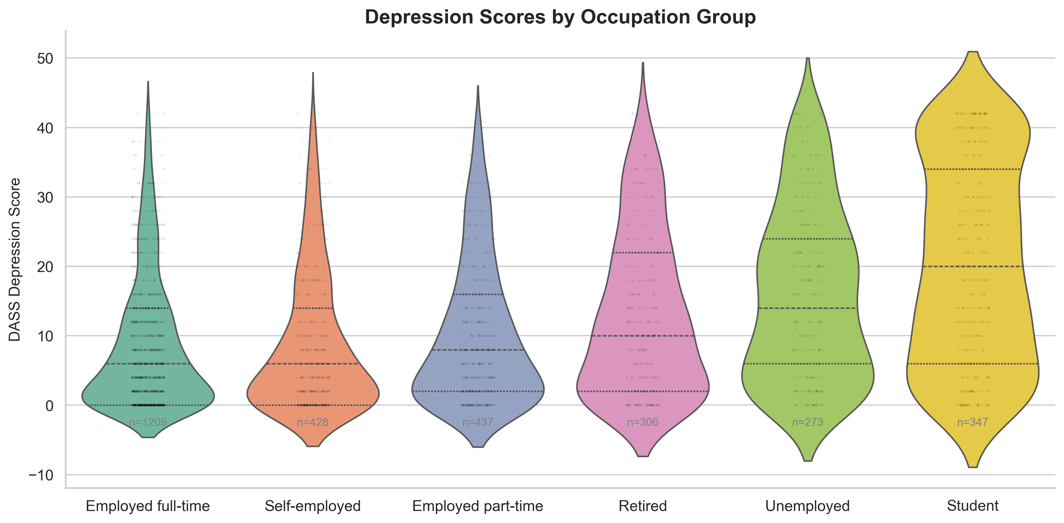
Bonus — depression scores by occupation group (students had highest scores)
Our Approach
Started by exploring the data — a correlation heatmap showed sleep, study hours, and exercise had the strongest associations with DASS Depression scores. Used these to plan a focused 2×2 scatter plot figure.
Key Finding
Sleep was the strongest predictor (r = −0.37). Study hours showed an unexpected positive association (r = +0.36) — possibly reflecting academic stress. Exercise was protective (r = −0.27).
What We Learned About Prompting
Exploring the data first made our prompts much more specific — we could name variables, expected relationships, and the DASS-21 score range. This produced working code on the first attempt.
Notebook vs Scripts
Notebooks were better for exploration (seeing results after each cell). Scripts were cleaner for the final product. Splitting into explore + visualise scripts mirrored real data science workflows.
Bonus Challenges
Extended the analysis with occupation-based violin plots — students had markedly higher depression (M = 20.3 vs 8.7 for full-time employed). The exploration step made bonus tasks easier to plan.